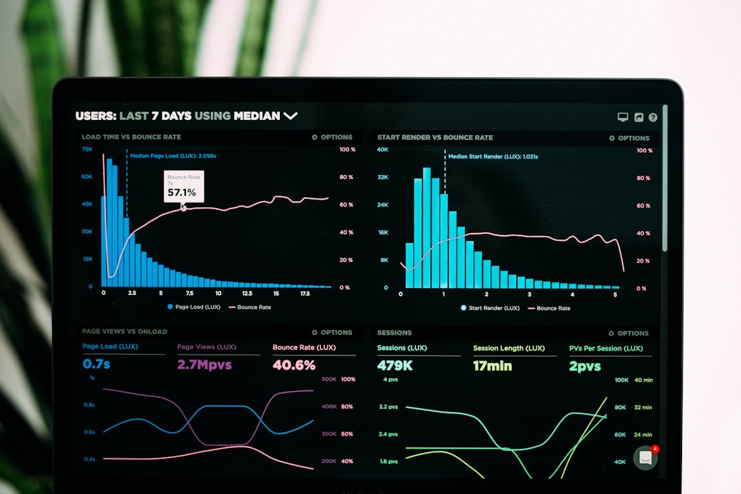
Artificial intelligence is revolutionizing the field of data visualization, transforming how we discover insights, create visualizations, and interact with data. As organizations grapple with ever-increasing data volumes and complexity, AI-powered visualization tools are emerging as critical allies in the quest to make sense of information and drive data-informed decisions.
In this post, we'll explore the current landscape of AI in data visualization, emerging trends, real-world applications, and what the future might hold for this rapidly evolving field.
The Convergence of AI and Data Visualization
At first glance, data visualization and artificial intelligence might seem like separate disciplines. Data visualization focuses on representing information visually to enhance human understanding, while AI aims to create systems that can perform tasks that typically require human intelligence.
However, these fields are increasingly converging, with AI enhancing visualization in several key ways:
- Automated insight discovery: AI can analyze datasets to identify patterns, anomalies, and relationships that might be worth visualizing
- Visualization recommendation: AI systems can suggest appropriate visualization types based on data characteristics and user goals
- Natural language interfaces: AI enables users to create and interact with visualizations using conversational language
- Personalized visualization: AI can adapt visualizations based on user preferences, expertise, and historical interactions
- Data preparation automation: AI streamlines the process of cleaning, transforming, and preparing data for visualization
This convergence is creating a new paradigm where the boundaries between human and machine contributions to the visualization process are increasingly blurred.
Key Applications of AI in Data Visualization
1. Automated Insight Generation
One of the most transformative applications of AI in visualization is automated insight discovery. Traditional visualization tools require users to manually explore data, looking for patterns and relationships. AI-powered tools can analyze data automatically, identifying potentially valuable insights and bringing them to users' attention.
Examples include:
- Anomaly detection: Identifying unusual patterns or outliers in data that may warrant investigation
- Correlation discovery: Finding relationships between variables that might not be immediately obvious
- Trend identification: Detecting patterns over time that indicate significant changes
- Segment analysis: Identifying subgroups within data that exhibit distinct behaviors or characteristics
For instance, Tableau's Explain Data feature analyzes the factors contributing to a specific data point, providing possible explanations for why a value is higher or lower than expected. Similarly, Power BI's Key Influencers visualization automatically identifies factors that influence a particular outcome.
2. Intelligent Visualization Recommendation
Choosing the right visualization for a specific dataset and analytical goal can be challenging, especially for non-experts. AI-powered recommendation engines can suggest appropriate visualization types based on:
- The structure and characteristics of the data (number of dimensions, data types, distribution, etc.)
- The analytical task or question being explored (comparison, distribution, relationship, composition, etc.)
- Best practices in data visualization
- User preferences and past behavior
Tools like Tableau's Show Me, IBM's Cognos Analytics, and Qlik's Insight Advisor offer intelligent visualization recommendations that help users create effective visualizations without requiring deep expertise in data visualization principles.
3. Natural Language Interfaces
Natural Language Processing (NLP) is transforming how users interact with visualization tools. Instead of using complex interfaces or query languages, users can simply ask questions in plain language and receive visualized answers.
For example:
- "Show me sales by region for the last quarter"
- "Compare customer satisfaction scores across product lines"
- "What were the top 5 performing stores last month?"
- "Visualize the relationship between marketing spend and revenue"
These natural language interfaces make data visualization more accessible to a broader range of users, including those without technical expertise. Power BI's Q&A feature, Tableau's Ask Data, and ThoughtSpot's SearchIQ are leading examples of this technology in action.
4. Automated Data Preparation
Data preparation—cleaning, transforming, and structuring data—is often the most time-consuming part of the visualization process. AI is streamlining this process through:
- Automated data cleaning: Identifying and correcting errors, inconsistencies, and missing values
- Intelligent data transformation: Suggesting appropriate transformations based on data characteristics
- Semantic recognition: Automatically identifying data types, categories, and hierarchies
- Data enrichment: Adding relevant context or supplementary data from external sources
Tools like Alteryx, Trifacta, and Tableau Prep use AI to automate and accelerate the data preparation process, reducing the time from raw data to visualization.
5. Augmented Analytics
Augmented analytics combines AI and human expertise to enhance the entire analytics workflow. This approach integrates automated insights, intelligent recommendations, and natural language processing to create a more intuitive and powerful analytical experience.
Key aspects include:
- Guided exploration: AI suggests relevant paths of inquiry based on the data and user behavior
- Automated narrative generation: Converting data insights into natural language explanations that accompany visualizations
- Predictive visualization: Incorporating machine learning models to project future trends or outcomes
- Contextual awareness: Adapting visualizations based on the user's role, expertise, and analytical context
Platforms like Qlik Sense, Power BI, and MicroStrategy are incorporating augmented analytics capabilities to create more powerful and accessible visualization experiences.
Real-World Examples and Case Studies
Case Study 1: Financial Services Fraud Detection
A major financial institution implemented an AI-powered visualization system to detect fraudulent transactions. The system uses machine learning to analyze transaction patterns and identify potential fraud, then generates visualizations that help analysts understand the context and relationships of suspicious activities.
Key benefits include:
- 30% increase in fraud detection rates
- 60% reduction in false positives
- Significant time savings for fraud analysts
- The ability to visualize complex fraud networks and patterns
The system combines anomaly detection algorithms with network visualization techniques to reveal relationships between accounts, transactions, and entities that might indicate coordinated fraud.
Case Study 2: Healthcare Patient Insights
A healthcare provider implemented an AI-powered visualization platform to analyze patient data and identify factors affecting outcomes. The system automatically generates dashboards that highlight key insights from electronic health records, helping clinicians identify patterns and make data-informed treatment decisions.
Notable features include:
- Automated identification of high-risk patients based on multiple factors
- Visualizations that explain the relative importance of different risk factors
- Natural language generation that provides clinical context for the visualized data
- Personalized dashboards that adapt to different clinical specialties
The system has helped reduce readmission rates by 15% by enabling more targeted interventions for high-risk patients.
Case Study 3: Retail Customer Analysis
A retail chain implemented an AI-powered visualization tool that helps store managers understand customer behavior and preferences. The system analyzes transaction data, customer demographics, and in-store movement patterns to generate insights about shopping behaviors.
Key capabilities include:
- Automatic segmentation of customers based on purchasing patterns
- Visualizations that show how different products relate to each other in customer purchases
- Heat maps that reveal high-traffic areas in stores
- Recommendations for product placement and promotions based on analyzed patterns
The implementation has resulted in a 12% increase in cross-selling and a 8% improvement in store layout efficiency.
Emerging Trends in AI-Powered Visualization
1. Generative AI for Visualization Creation
The rise of generative AI models like GPT-4 and DALL-E is opening new possibilities for visualization creation. These models can:
- Generate custom visualizations based on natural language descriptions
- Create explanatory visuals to accompany data insights
- Design infographics that combine data visualization with contextual information
- Transform rough sketches or descriptions into polished visualizations
For example, platforms like Flourish are exploring how generative AI can help users create more compelling data stories with less manual effort.
2. Multimodal Interaction
Future visualization systems will support multiple modes of interaction, combining:
- Natural language queries and commands
- Gesture-based interaction (particularly in AR/VR environments)
- Traditional point-and-click interfaces
- Voice commands and feedback
This multimodal approach will make visualizations more accessible and intuitive, allowing users to interact with data in ways that feel natural to them.
3. Immersive Data Experiences
AI is enabling more immersive data experiences through:
- Virtual reality (VR) visualizations: Creating 3D data environments that users can explore from within
- Augmented reality (AR) data overlays: Superimposing data visualizations on real-world objects and environments
- Spatial analytics: Analyzing and visualizing data in physical spaces
- Multi-sensory feedback: Using sound, haptics, and other sensory channels to convey data
These immersive experiences can help users develop new insights by experiencing data in more intuitive and engaging ways.
4. Explainable AI Visualizations
As AI becomes more deeply integrated into decision-making processes, there's a growing need to visualize and explain AI models themselves. This emerging field focuses on:
- Visualizing how AI models make predictions or classifications
- Revealing the relative importance of different factors in model decisions
- Showing model uncertainty and confidence levels
- Explaining complex model behavior in intuitive visual formats
Tools like LIME, SHAP, and model-specific visualization techniques are helping data scientists and end-users understand and trust AI-driven insights.
5. Collaborative AI-Human Visualization
The future of data visualization will involve more collaborative processes where humans and AI systems work together to create visualizations and generate insights:
- AI systems suggesting initial visualizations that humans can refine
- Humans providing feedback that helps AI systems improve their recommendations
- AI augmenting human creativity with automated techniques and suggestions
- Collaborative workflows where multiple people and AI systems contribute to analysis
This collaborative approach leverages the strengths of both human creativity and machine processing power to create more effective visualizations.
Challenges and Considerations
While AI offers tremendous potential for data visualization, several challenges must be addressed:
1. Data Privacy and Security
AI-powered visualization systems often require access to large amounts of data, raising concerns about:
- Protecting sensitive or personal information in visualizations
- Ensuring appropriate data access controls
- Maintaining data privacy when using cloud-based AI services
- Complying with regulations like GDPR, CCPA, and industry-specific requirements
2. Bias and Fairness
AI systems can perpetuate or amplify biases present in training data or algorithms, leading to:
- Biased insight generation that overemphasizes certain patterns
- Unfair representations of different demographic groups
- Recommendations that reinforce existing assumptions
- Visualization choices that inadvertently misrepresent certain data points
Organizations must implement robust testing and governance to ensure AI-powered visualizations are fair and balanced.
3. Transparency and Trust
For AI-powered visualizations to be effective, users must understand and trust the insights they generate:
- Clearly communicating how AI-generated insights were derived
- Providing appropriate context for automated recommendations
- Allowing users to "look under the hood" when necessary
- Building systems that earn trust through accuracy and reliability
4. Skills and Adoption
The integration of AI into visualization workflows requires:
- Training users to work effectively with AI-powered tools
- Developing new skills that combine data literacy with AI understanding
- Managing resistance to AI-driven changes in analytical processes
- Creating intuitive interfaces that minimize learning curves
Getting Started with AI-Powered Visualization
Organizations looking to leverage AI for data visualization can consider these practical steps:
1. Assess Current Capabilities and Needs
- Evaluate existing visualization tools and processes
- Identify pain points and opportunities for AI enhancement
- Consider the skills and expertise of your user base
- Define clear objectives for AI implementation
2. Start with Built-in AI Features
- Many existing visualization platforms now include AI capabilities
- Explore features like automated insights in Tableau, Power BI, or Qlik
- Use these built-in features to build familiarity and demonstrate value
- Gather user feedback on the utility of AI-generated insights
3. Pilot Specialized AI Visualization Tools
- Identify specific use cases where specialized AI tools could add value
- Implement small-scale pilots to test effectiveness
- Measure outcomes against clear success criteria
- Use learnings to inform broader implementation
4. Develop an AI Visualization Strategy
- Create a roadmap for integrating AI into visualization workflows
- Address data governance, privacy, and ethical considerations
- Plan for necessary skills development and training
- Establish processes for evaluating and adopting new AI capabilities
Conclusion: The Future of Data Visualization is Intelligent
The integration of AI into data visualization represents a fundamental shift in how we interact with and derive insights from data. By automating routine tasks, suggesting optimal visualizations, discovering hidden patterns, and enabling natural language interaction, AI is making visualization more powerful, accessible, and impactful.
As these technologies continue to evolve, we can expect even more transformative applications that blend human creativity with machine intelligence. The most successful organizations will be those that thoughtfully implement AI-powered visualization tools while maintaining a focus on human needs, ethical considerations, and business value.
The future of data visualization isn't just about more beautiful charts—it's about more intelligent, accessible, and insightful ways of understanding our increasingly complex world through data.
What AI-powered visualization tools have you explored? How has AI changed your approach to understanding data? Share your experiences in the comments below!


