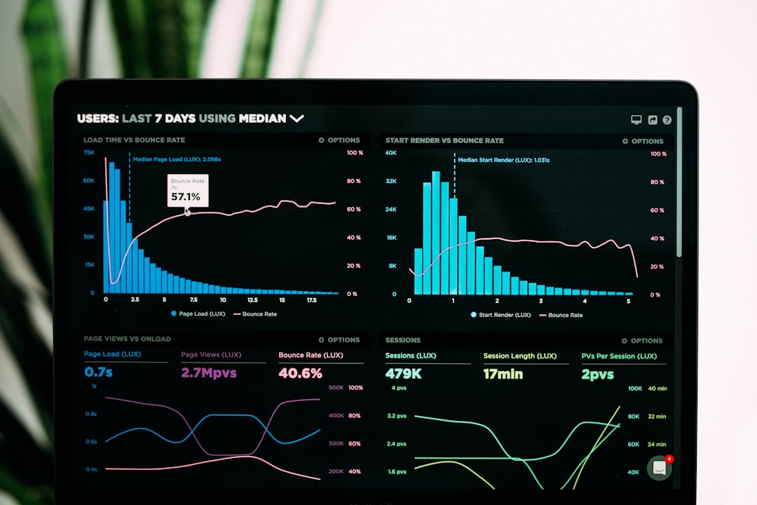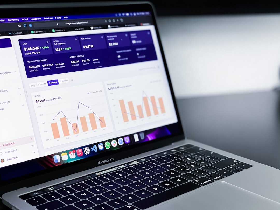
Interactive dashboards have revolutionized how we consume and analyze data. Unlike static reports, interactive dashboards allow users to explore data, discover insights, and answer their own questions without requiring technical expertise. In this post, we'll explore the fundamentals of creating effective interactive dashboards using modern visualization tools.
What Makes a Dashboard "Interactive"?
An interactive dashboard goes beyond displaying static charts and graphs. It gives users the ability to manipulate the view, drill down into details, and customize their analysis. Key interactivity features include:
- Filtering: Allowing users to focus on specific segments of data
- Sorting: Enabling users to order data based on different metrics
- Drill-down capabilities: Providing deeper details when users click on elements
- Parameter controls: Letting users adjust variables that affect calculations or visualizations
- Tooltips and hover effects: Revealing additional information when users hover over elements
- Cross-filtering: Making selections in one chart that filter other charts on the dashboard
Planning Your Interactive Dashboard
Before diving into building your dashboard, it's crucial to plan it thoroughly. Consider the following steps:
1. Define Your Audience and Objectives
Who will use the dashboard, and what decisions will they make with it? Different audiences have different needs:
- Executives: May need high-level KPIs with the ability to drill down when necessary
- Analysts: Often require detailed views with extensive filtering and exploration capabilities
- Operational teams: Usually need focused dashboards that highlight exceptions and action items
- External stakeholders: Might need simpler interfaces with clear explanations and guided navigation
2. Select the Right Data
Not all data belongs on a dashboard. Focus on metrics that:
- Directly support the dashboard's objectives
- Drive decision-making for your target audience
- Can be updated regularly to ensure relevance
- Provide context when viewed together
3. Choose an Appropriate Layout
The layout should guide users through a logical flow of information:
- Z-pattern layout: Places the most important information along a Z-shaped path (top-left to bottom-right)
- F-pattern layout: Arranges content in horizontal sections that users scan from left to right
- Hierarchical layout: Organizes information from most important to least important
- Grid layout: Uses equal-sized sections for balanced comparisons
4. Sketch Your Dashboard
Before building in your visualization tool, sketch the dashboard layout and functionality. This helps identify potential issues early and ensures all stakeholders are aligned on the vision.
Choosing the Right Visualization Tool
Different tools offer various capabilities for creating interactive dashboards. Here are some popular options and their strengths:
Tableau
Strengths for interactive dashboards:
- Intuitive drag-and-drop interface for creating powerful interactions
- Rich set of dashboard actions (filter, highlight, parameter controls)
- Excellent tooltip customization
- Robust dashboard layout options
- Strong mobile responsiveness
Power BI
Strengths for interactive dashboards:
- Tight integration with Microsoft ecosystem
- Power Query for data preparation
- DAX for complex calculations
- AI-powered Q&A features
- Bookmarks for saved states and navigation
Looker
Strengths for interactive dashboards:
- LookML for centralized metric definitions
- Strong drill-anywhere capabilities
- Embedded analytics options
- Scheduled delivery of insights
- Granular user permissions
Qlik Sense
Strengths for interactive dashboards:
- Associative engine that shows related and unrelated data
- Strong cross-filtering capabilities
- Responsive design for different devices
- Advanced analytics integration
- Storytelling features
Best Practices for Building Interactive Dashboards
1. Focus on User Experience
A visually stunning dashboard is useless if users can't navigate it intuitively. Consider these UX principles:
- Intuitive layout: Place the most important information where users will look first
- Clear instructions: Provide guidance on how to interact with the dashboard
- Consistent design: Use consistent colors, fonts, and interaction patterns
- Progressive disclosure: Show the most important data first, with options to reveal more details
- Responsive design: Ensure the dashboard works well on different devices and screen sizes
2. Optimize Performance
Slow dashboards frustrate users and reduce adoption. Improve performance by:
- Limiting the amount of data displayed at once
- Using aggregated data when possible
- Implementing efficient filters
- Optimizing calculations
- Using incremental data loading when appropriate
3. Design for Clarity
The goal is communication, not decoration. Enhance clarity by:
- Using appropriate chart types for your data
- Eliminating chart junk and unnecessary decorations
- Implementing a logical color scheme that highlights important information
- Adding clear titles, labels, and legends
- Including context and benchmarks
4. Build in Guidance
Help users understand what they're seeing and how to use it:
- Include clear instructions for interactive elements
- Add informative tooltips that provide context
- Incorporate annotation layers to highlight key insights
- Consider adding a "Getting Started" section for new users
- Use visual cues to indicate where interaction is possible
Interactive Dashboard Examples and Use Cases
Example 1: Sales Performance Dashboard
A sales dashboard might include:
- Top-level KPIs showing overall performance
- Geographic map with sales by region that filters other charts when clicked
- Time series chart with slider control to adjust the date range
- Product category breakdown with drill-down to individual products
- Sales rep performance with parameter controls to adjust targets
Example 2: Customer Analytics Dashboard
A customer analytics dashboard could feature:
- Customer segmentation overview with interactive filters
- Cohort analysis with selectable cohort parameters
- Customer journey visualization with clickable stages
- Retention metrics with adjustable time frames
- Predictive churn indicators with threshold controls
Example 3: Operations Monitoring Dashboard
An operations dashboard might include:
- Real-time performance metrics with automatic refresh
- Alert indicators that highlight issues needing attention
- Process flow visualization with clickable stages to see details
- Resource utilization charts with filters for different teams or equipment
- Historical trend comparisons with adjustable baseline periods
Testing and Iterating Your Dashboard
Creating an effective dashboard is an iterative process:
- User testing: Observe real users interacting with your dashboard to identify confusion points
- Gather feedback: Collect structured feedback on usability and utility
- Monitor usage patterns: Use analytics to see which features are being used and which are ignored
- Iterate: Make improvements based on feedback and usage data
- Document changes: Keep users informed about new features and improvements
Advanced Interactivity Techniques
Once you've mastered the basics, consider these advanced techniques:
- Custom navigation flows: Create guided analytics paths for different user journeys
- Conditional formatting: Change visual properties based on data values or user selections
- What-if analysis: Allow users to adjust parameters and see how outputs change
- Embedded analytics: Incorporate dashboards into other applications for contextual insights
- Natural language interaction: Enable users to ask questions about the data in plain language
Conclusion
Interactive dashboards are powerful tools for democratizing data and enabling data-driven decision-making across organizations. By carefully planning your dashboard, choosing the right visualization tool, and following best practices for design and interactivity, you can create compelling dashboards that engage users and drive insights.
Remember that the most successful dashboards evolve over time based on user feedback and changing business needs. Start with a focused minimum viable product, then iterate and expand based on what you learn from real-world usage.
Have you created interactive dashboards with any of these tools? What challenges did you face, and what techniques worked best for your users? Share your experiences in the comments below!


